
Responsive Web Design in 2026: Beyond Breakpoints
Media queries were just the beginning. Here's how container queries, fluid typography, and intrinsic layouts build sites that adapt to any screen, component, and user.
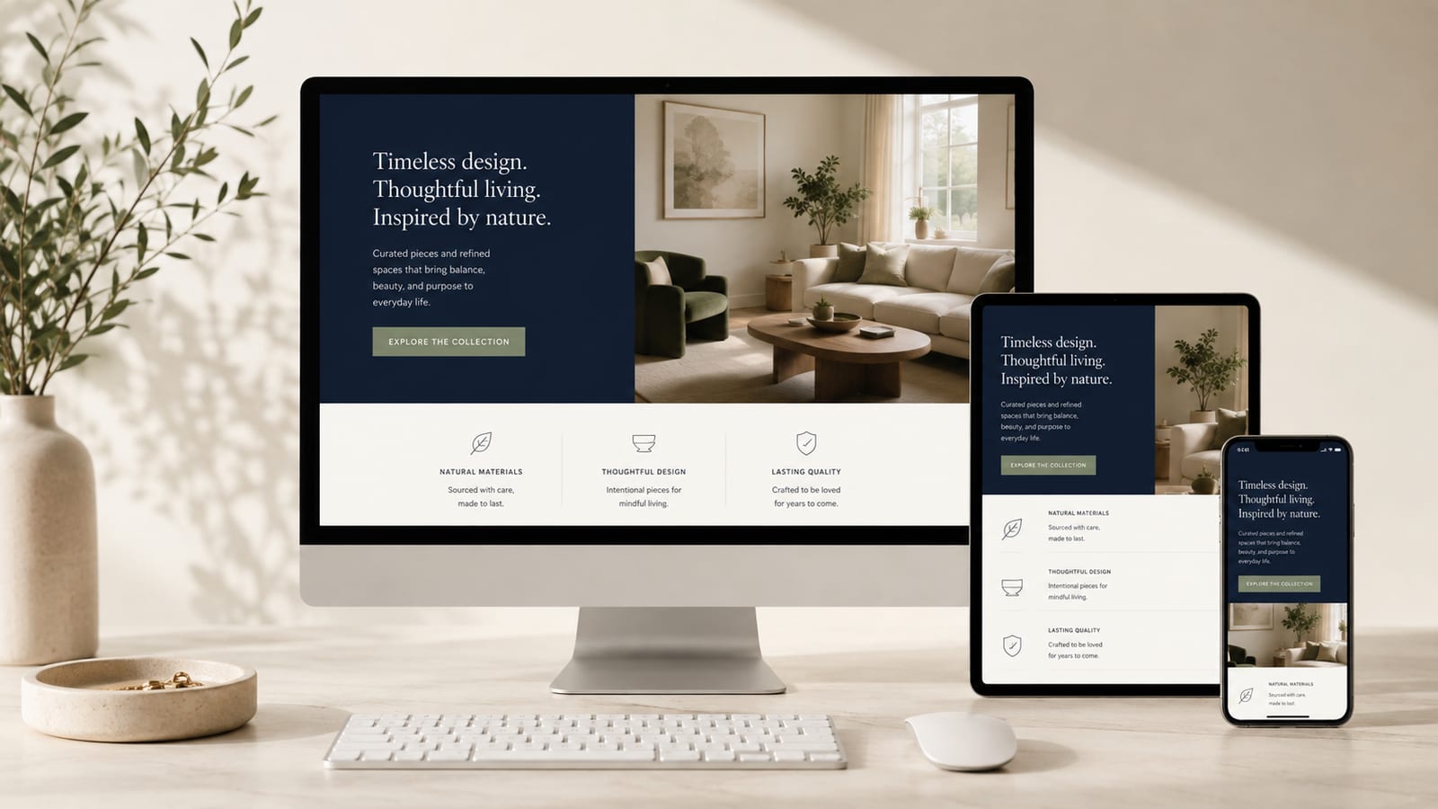
Responsive web design used to mean one thing: drop a couple of media queries at 768px and 1024px, watch the layout snap into place, and call it a day. In 2026, that playbook is officially retired. Screens now range from a smartwatch to an ultrawide monitor to a foldable that changes size mid-session, and users expect every one of them to feel considered.
The good news? CSS has quietly become ridiculously good at this. The tools that used to require JavaScript hacks, media query spaghetti, or just crossing your fingers are now baked right into the browser. Container queries, fluid typography, intrinsic grids: all shipped, all supported, all production-ready.
So whether you’re a business owner planning a redesign, a designer leveling up, or a developer who wants to ditch the breakpoint pileup, this guide covers what responsive web design actually looks like in 2026, and how to build sites that adapt to anything.
What “responsive” really means now
Back in 2010, responsive design was a genuine revolution: fluid grids, flexible images, and media queries let one codebase serve every device. But the mental model that came with it, “pick a few screen widths and design for each,” is exactly what’s holding a lot of sites back today.
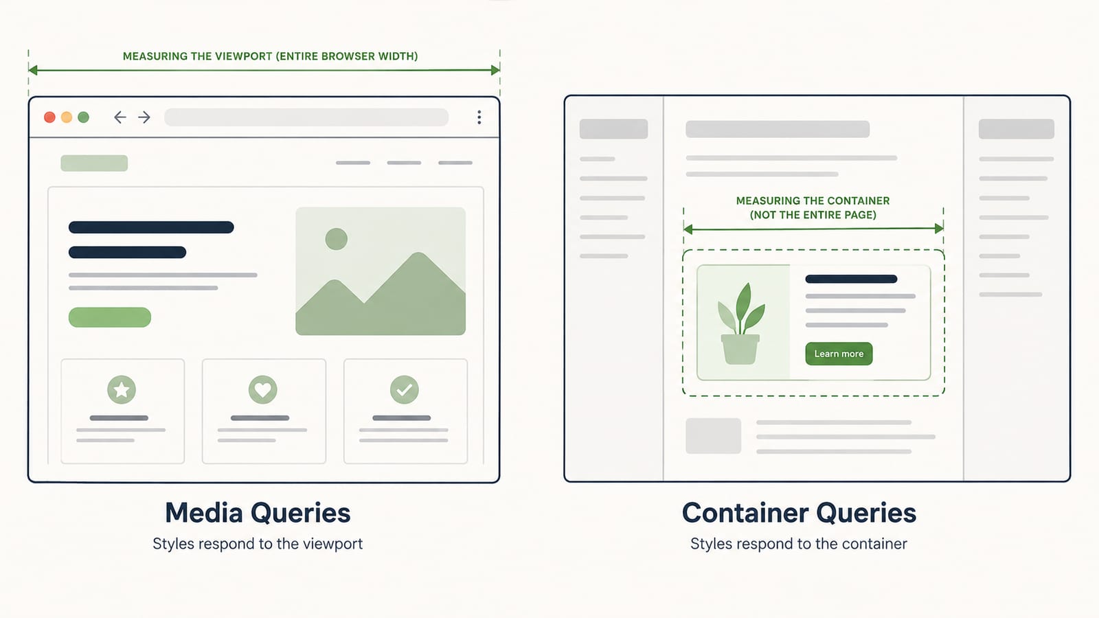
The problem is that the viewport was always a blunt instrument. Knowing the browser window is 1200px wide tells you nothing about the box a specific component actually lives in. A product card might sit full-width on one page and squished into a narrow sidebar on another. Media queries can’t tell the difference. So you end up writing brittle, page-specific overrides and praying nothing shifts.
The 2026 definition flips it. Responsive design is now about building components and layouts that adapt to their own context, using the browser’s native layout engine instead of a wall of hardcoded rules. Less “design for these five widths,” more “describe how things should behave and let the browser do the math.”
Container queries: components that adapt themselves
This is the big one. Container queries let an element respond to the size of its parent container instead of the whole viewport. It sounds like a small distinction. It’s honestly the biggest shift in responsive design since media queries themselves.
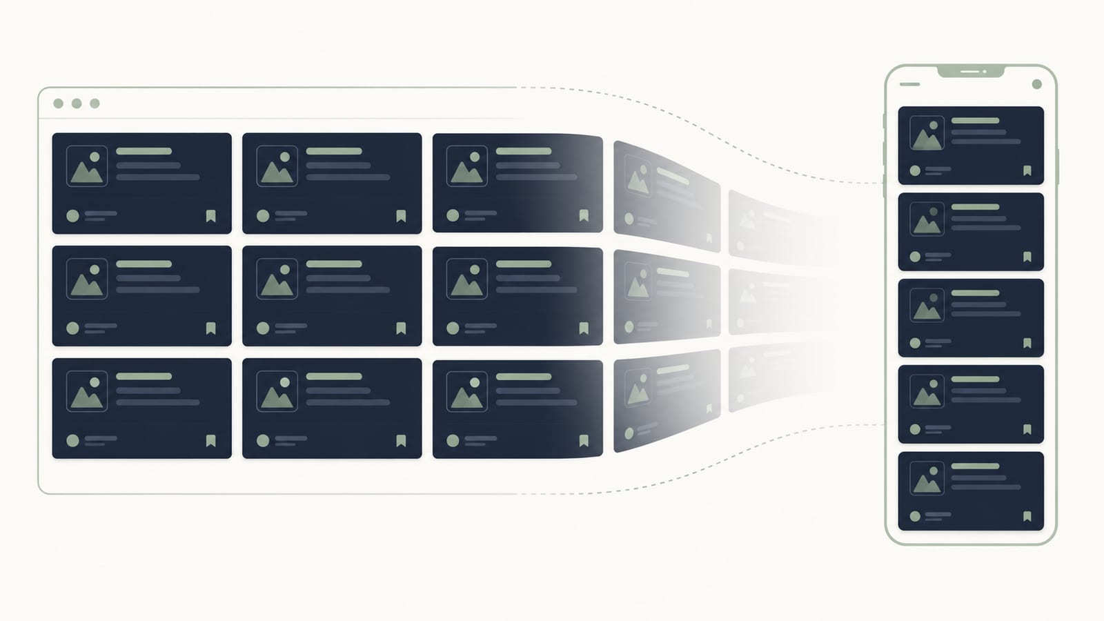
Here’s why it matters. With a container query, you write a component’s responsive behavior once, and it just works everywhere you place it: main column, sidebar, modal, three-across grid, doesn’t matter. The component looks at the space it’s been given and adjusts. That’s genuinely composable design, and it kills an entire category of page-specific CSS.
The syntax is refreshingly readable:
.card-wrapper {
  container-type: inline-size;
}

@container (min-width: 400px) {
  .card {
    display: grid;
    grid-template-columns: 140px 1fr;
  }
}
That card switches to a two-column layout whenever its container is at least 400px wide, no matter what the viewport is doing. Browser support is no longer a worry either: container size queries have been supported across Chrome, Firefox, and Safari since 2023, so they’re a safe default in 2026, no polyfills required.
The practical takeaway: media queries aren’t dead, but they’ve been demoted. Use them for big-picture, page-level shifts (like collapsing a whole navigation), and reach for container queries for basically everything at the component level.
Fluid typography with clamp()
Remember bumping font-size at every breakpoint so headings didn’t look absurd on mobile? You can stop. The clamp() function makes type scale smoothly between a minimum and maximum, with zero media queries.
It takes three values: a minimum, a preferred (usually viewport-based), and a maximum. So this:
h1 {
  font-size: clamp(2rem, 5vw, 4rem);
}
gives you a headline that never drops below 2rem, never grows past 4rem, and fluidly scales with the viewport in between. One line replaces what used to be three or four separate rules. Beautiful.
The same trick works for spacing, margins, padding, and gaps, which is how you get layouts that breathe naturally across screen sizes instead of lurching between fixed states. Fluid spacing plus fluid type is a huge part of why modern sites feel so much smoother than they did a few years ago.
One accessibility note that’s easy to miss: use rem for your minimum and maximum, not px. A rem-based clamp still respects a user who’s bumped up their browser font size. A pixel-locked one ignores them entirely, which is the kind of quiet accessibility failure that gets sites in trouble.
Intrinsic layouts: let the browser do the math
Coined by Jen Simmons, “intrinsic web design” is the idea that your layout should respond to its content and available space automatically, rather than to a fixed set of breakpoints you decided on in advance. CSS Grid and Flexbox are the engines here, and they’ve picked up serious power.
The classic example is a card grid that reflows with no media queries at all:
.grid {
  display: grid;
  grid-template-columns: repeat(auto-fit, minmax(280px, 1fr));
  gap: 1.5rem;
}
That grid fits as many 280px-plus columns as the space allows and reflows on its own as the container shrinks or grows. No breakpoints, no math, no fuss. Pair it with container queries and you’ve got layouts that are genuinely resilient.
Subgrid rounds it out by letting nested elements align to a parent grid, so things like card headers, bodies, and footers line up perfectly across a row even when the content length varies. It’s the kind of detail that separates a polished layout from a slightly-off one, and it’s fully supported now.
Responsive images and media
Layout is only half the story. Serving a 3000px hero image to a phone is a great way to torch your load times and your mobile users’ data plans. Responsive images solve this with srcset and sizes, letting the browser pick the right file for the device.
<img
  src="hero-800.jpg"
  srcset="hero-400.jpg 400w, hero-800.jpg 800w, hero-1600.jpg 1600w"
  sizes="(max-width: 600px) 100vw, 50vw"
  alt="Descriptive alt text"
  loading="lazy"
  width="1600"
  height="900"
>
A few things earning their keep there. Modern formats like AVIF and WebP cut file size dramatically over JPEG and PNG. loading="lazy" defers offscreen images so they don’t block the initial render. And always setting width and height (or an aspect-ratio in CSS) reserves the space, which prevents layout shift, one of the metrics Google actively watches.
For art direction, when you want a different crop on mobile versus desktop rather than just a different size, the <picture> element gives you full control. It’s the responsive-image workhorse when a simple srcset isn’t enough.
Accessibility is part of being responsive
Here’s a reframe worth sitting with: responsive design and accessible design are the same project. Both are about meeting users where they are, on whatever device, with whatever needs and preferences. A site that reflows beautifully but fails a keyboard user isn’t responsive in any meaningful sense.
What that looks like in practice:
- Breakpoints in rem, not px, so your layout scales with a user’s chosen font size instead of fighting it.
- Touch targets of at least 44x44px, so buttons and links are comfortably tappable on a phone and forgiving for anyone with limited motor control.
- Respecting
prefers-reduced-motion, so your slick scroll animations don’t make motion-sensitive visitors nauseous. - Contrast that holds up at every size, meeting WCAG guidelines whether text is displayed large or small.
None of this is extra work bolted on at the end. When you build responsive the modern way, accessibility mostly falls out of the same decisions. And with accessibility regulations tightening across the EU, US, and beyond, “we’ll do it later” is a genuinely risky bet. For a deeper look at how design choices connect to real-world results, our guide on 2026 web design trends digs into the accessibility-first shift.
Performance: a responsive site has to be fast
You can nail every breakpoint and still ship a bad experience if the thing takes six seconds to load on a mid-range phone over spotty coverage. Responsive design in 2026 assumes performance is part of the definition, not a separate concern.
The modern CSS approach actually helps here. Container queries, clamp(), and intrinsic grids are all native, compositor-friendly, and lightweight. They replace the JavaScript-heavy responsive libraries we used to lean on, which means less code to download, parse, and run. Doing more with less is the whole vibe.
This ties directly into Core Web Vitals, Google’s user-experience metrics that influence your search rankings. Responsive images prevent layout shift, lazy loading speeds up first paint, and lean CSS keeps interactivity snappy. Responsive and fast aren’t in tension. Done right, they reinforce each other.
A practical responsive workflow for 2026
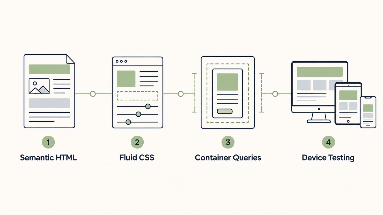
So how do you actually put this together without over-engineering it? A sane order of operations:
- Start with content and structure. Semantic HTML first, before a single line of CSS. If it makes sense as a plain document, you’re on solid ground.
- Design fluid by default. Reach for
clamp(),min(),max(), andfrunits so most of your layout adapts on its own, no breakpoints needed. - Add container queries for components. Make each reusable piece responsible for its own responsiveness.
- Use media queries sparingly, only for genuine page-level shifts like collapsing navigation or restructuring a full-page layout.
- Test on real constraints. Actual devices, throttled connections, keyboard-only navigation, and a screen reader. Emulators lie a little; real conditions don’t.
Notice how few hardcoded breakpoints show up in that list. That’s the point. The 2026 mindset is to describe intent and let the browser resolve the specifics, reserving manual breakpoints for the handful of moments that truly need them.
Responsive mistakes that still trip teams up
Even in 2026, the same avoidable stumbles show up again and again:
- Designing for exact device widths. “iPhone is 393px” thinking bakes in assumptions that break the moment a new device lands. Design for ranges and content, not specific phones.
- Pixel-based breakpoints and type. They ignore user font-size preferences and quietly undermine accessibility. Go rem.
- Forgetting the in-between. A layout can look perfect at 375px and 1440px and fall apart at 900px. Resize slowly through the whole range and watch.
- Hiding content on mobile. Smaller screen doesn’t mean a lesser experience. If content matters on desktop, it usually matters on mobile too. Rethink the presentation, don’t just
display: noneit. - Skipping real-device testing. Browser dev tools are great, but they don’t catch touch quirks, real network lag, or how a layout actually feels in the hand.
Dodge those and you’re already ahead of a huge chunk of the web.
Frequently Asked Questions
Is responsive web design still relevant in 2026?
More than ever. The tools have changed, but the goal is the same: one site that works well on any screen. With the range of devices in 2026, from watches to foldables to ultrawides, responsive design isn’t optional. What’s changed is that it now leans on native CSS like container queries and fluid typography instead of stacks of media queries.
What is the difference between media queries and container queries?
Media queries respond to the size of the browser viewport, while container queries respond to the size of an element’s parent container. Container queries let a single component adapt to whatever space it’s placed in, so the same card or widget works in a sidebar, a modal, or a full-width row without page-specific overrides. In 2026, media queries handle page-level shifts and container queries handle component-level ones.
Do I still need to design mobile-first?
Mobile-first is still a solid default because it forces you to prioritize content and performance under the tightest constraints. That said, modern fluid and intrinsic techniques mean you’re often designing for a continuous range rather than a strict small-to-large progression. Start with content and let the layout adapt in both directions.
How many breakpoints should a responsive website have?
Fewer than you think. With fluid typography, intrinsic grids, and container queries doing most of the adapting, many 2026 sites need only a handful of true breakpoints, sometimes just one or two for major layout shifts. Anchor the ones you do use to content, not to specific device widths, and define them in rem.
Does responsive design affect SEO?
Yes, significantly. Google uses mobile-first indexing, so it evaluates the mobile version of your site for ranking. A responsive site that loads fast, avoids layout shift, and stays usable on any device directly supports Core Web Vitals and search performance. Poor mobile experiences get penalized, so responsive design is an SEO fundamental, not a nice-to-have.
Key takeaways
Responsive web design in 2026 has moved past the old breakpoint checklist. The modern approach leans on the browser's own layout smarts: container queries, fluid typography, and intrinsic grids that adapt without a pile of hardcoded rules.
- Think components, not pages. Container queries let a card or sidebar respond to its own space, so the same component works anywhere you drop it.
- Go fluid, not stepped. clamp() scales type and spacing smoothly between a min and max, killing most of your font-size breakpoints.
- Anchor breakpoints to rem. Breakpoints in rem respect a user's font-size settings; pixel breakpoints ignore them and quietly break accessibility.
- Responsive means fast and usable. A layout that reflows but tanks Core Web Vitals or fails a screen reader isn't actually responsive.
- Get a second set of eyes. Modern responsive work rewards both design judgment and current CSS know-how. That's exactly what we do.

Daniel Klein
Founder & Digital Strategy Lead at ClarroxWeb, based in Frankfurt, Germany. With real business experience as a CEO and a strong focus on marketing and sales, Daniel designs websites that generate sales, strengthen market positioning, and drive sustainable growth.
Read next

How to Start an Online Store in 2026: A Step-by-Step Guide
If you build a website, you will replatform. Here's how to build a system instead.

The Definitive Guide to Web Design Trends Shaping 2026
AI, immersive scroll experiences, bento grids, dark mode by default: here are the 10 trends redefining how websites look, feel, and perform this year.
Front-End vs Back-End Development: What's the Difference and Why It Matters
Everything you need to know about the two sides of web development, what each one does, and why understanding the difference can save you time, money, and headaches.