Let’s be honest, the web design scene in 2026 looks nothing like it did even two years ago. CSS keeps dropping new superpowers, browser APIs are getting smarter by the month, and AI tools? They’re literally everywhere now. Meanwhile, the people visiting your site expect it to load in a snap, feel buttery smooth, and look like nothing they’ve seen before. No pressure, right?
What makes this year so exciting is the push-and-pull happening across the industry. Designers are leaning on AI to speed up their workflows, but at the same time, they’re pushing back hard against cookie-cutter aesthetics with bolder, more expressive choices. And performance and accessibility? Those aren’t just “nice-to-haves” anymore, they’re the bare minimum thanks to new regulations and Google being, well, Google.
Whether you’re a business owner thinking about a redesign, a designer sharpening your skills, or a developer who just wants to stay in the loop, this guide covers the 10 web design trends that are defining 2026, and more importantly, how to actually put them to work on sites that perform.
1. AI-Powered Design Systems
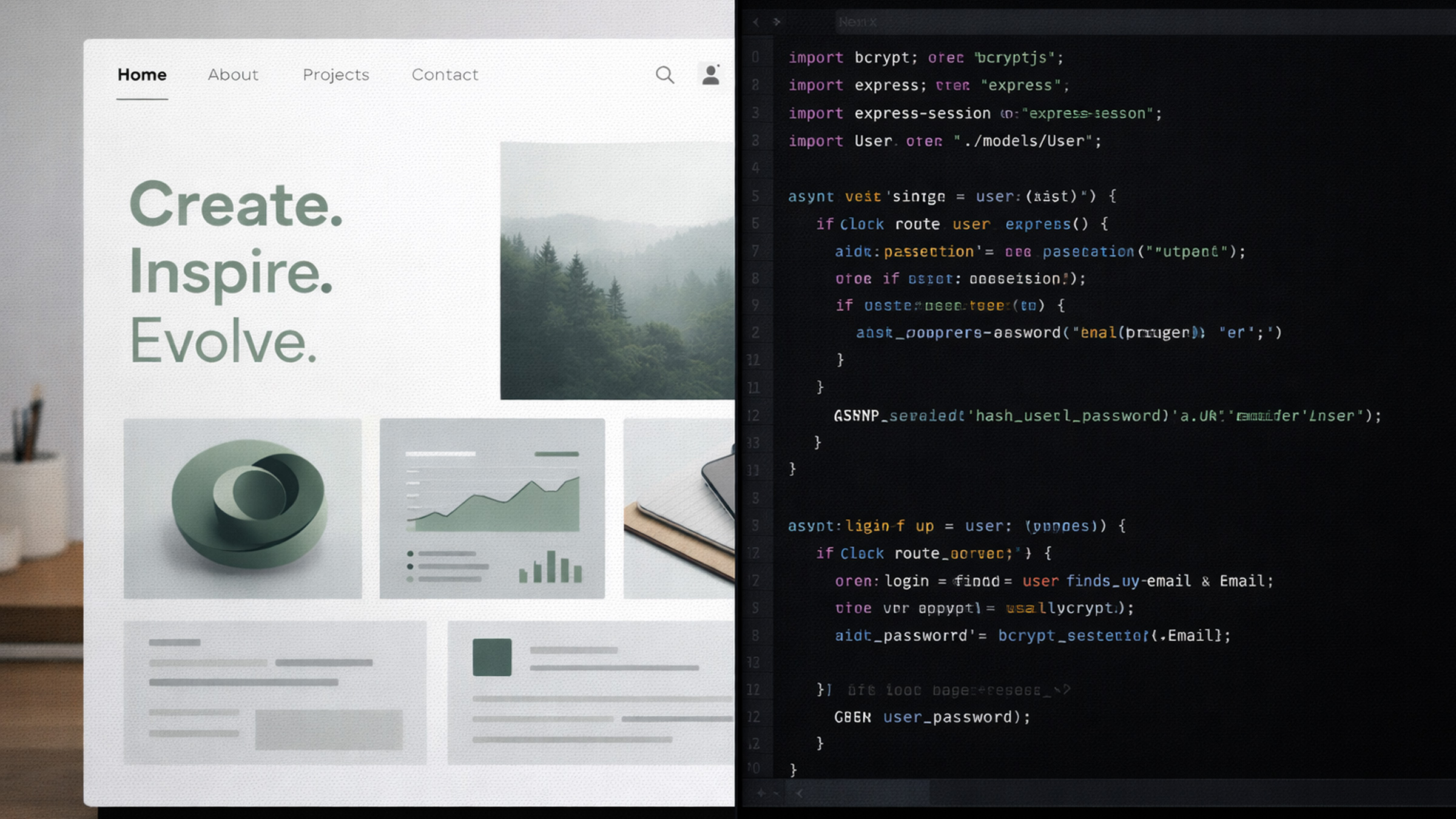
OK, let’s get this one out of the way first because yes, AI is everywhere. But here’s the thing, it’s not replacing designers in 2026. It’s making them way faster. Tools like Figma, Framer, and Webflow have AI baked right in now, so designers can generate layout variations, pull color palettes from brand guidelines, crank out microcopy, and even export production-ready code without breaking a sweat.
But the real plot twist? AI-powered design systems. Instead of maintaining some boring static component library, teams are building adaptive systems where AI suggests the right component, spacing, and typography hierarchy based on what you’re actually designing. Need a testimonial section? The system looks at your existing design tokens and spits out three options that fit perfectly. Pretty slick.
Here’s the catch for businesses though: AI-generated designs still need a human eye. The best agencies in 2026 use AI to skip the repetitive grind and explore way more creative directions, not to skip the thinking entirely. The result? Faster turnarounds without sacrificing originality. That’s a win-win if we’ve ever seen one.
2. Scroll-Driven Animations & Immersive Storytelling
CSS scroll-driven animations have officially landed with full browser support, and honestly? They’re a total game-changer. We’re way past basic parallax effects at this point. Designers in 2026 are building rich, narrative-driven experiences where scrolling is the main way you interact with the page.
Think of it like editorial design meets web interaction. As users scroll, elements fade in, shift, scale, and transform based on scroll position, all orchestrated through pure CSS with the animation-timeline: scroll() property. No JavaScript needed for the basics. Yeah, you read that right.
This trend is seriously powerful for:
- Product landing pages that walk users through features step by step
- Portfolio sites that reveal project details as you scroll
- Brand storytelling pages that unfold like a digital magazine
The secret to nailing this? Restraint. The best scroll-driven sites in 2026 use animation to guide attention and reinforce hierarchy, not to make you dizzy. Every animation should have a purpose: revealing information, creating an emotional connection, or nudging the user toward an action.
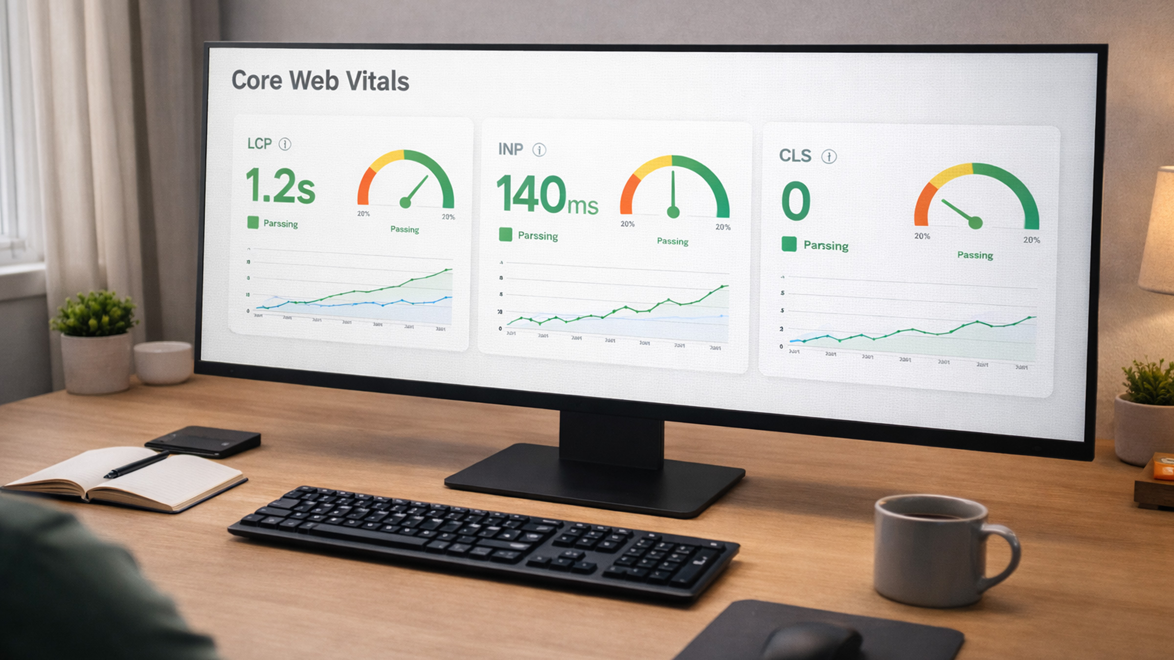
Performance tip: because these animations are CSS-native and compositor-driven, they run at 60fps without blocking the main thread. That’s a massive upgrade from the JavaScript-based scroll libraries we used to lean on.
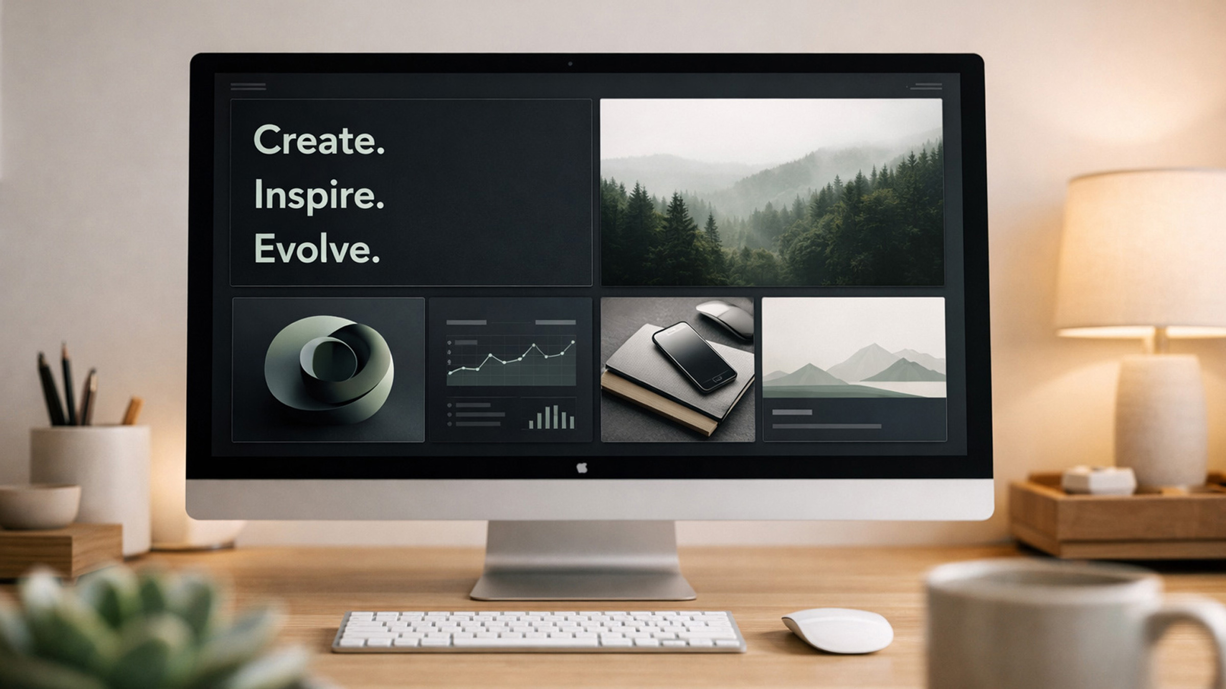
3. Bento Grid Layouts
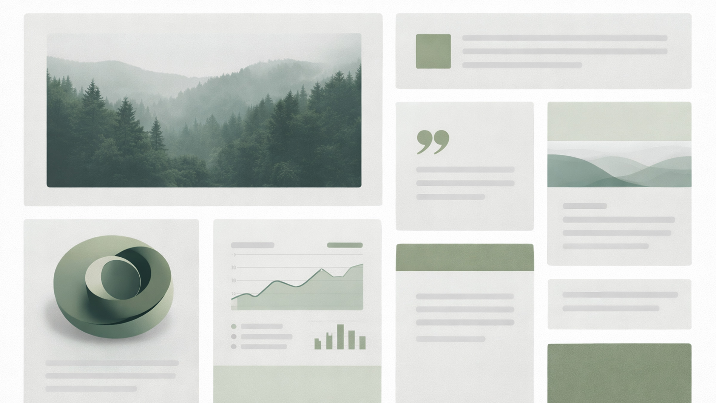
If you’ve been anywhere near Apple’s marketing pages lately, you’ve seen the bento grid in action. Named after Japanese bento boxes with their neatly partitioned compartments, this layout pattern has evolved from a fun novelty into a legit foundational approach. SaaS companies, fintech brands, creative portfolios, everyone’s getting in on it.
What makes it so effective in 2026 is the flexibility. A single bento grid can hold statistics, feature descriptions, testimonial quotes, icons, and images, all in a cohesive, scannable format. It’s basically the antidote to the “everything is a card in a three-column grid” monotony that dominated previous years. Thank goodness.
CSS Grid and Subgrid make implementation pretty straightforward. Designers define a grid with varying row and column spans, creating visual rhythm through intentional size contrast. Large hero modules anchor the layout while smaller cells provide supporting detail.
Best practice: don’t let the grid become a dumping ground. Each cell should earn its place. The most effective bento layouts cap themselves at 6–8 modules, each with a single clear purpose.
4. Dark Mode as the New Default
Dark mode isn’t an afterthought toggle hiding in a settings menu anymore. In 2026, a lot of the best-designed websites launch dark-first, treating the light theme as the backup option.
Why the shift? A few reasons. OLED screens are mainstream now (and dark mode saves battery), users consistently prefer dark interfaces for extended browsing sessions, and let’s be real, dark backgrounds just make things pop. Photography, illustrations, accent colors, typography, everything carries more visual weight against a dark canvas.
Implementing dark mode properly in 2026 means:
- Designing both variants at the same time, not converting one from the other after the fact
- Using
prefers-color-schemefor automatic system detection - Testing contrast ratios like your life depends on it, WCAG compliance is even stricter in dark contexts
- Avoiding pure black (
#000000) backgrounds, they cause harsh contrast and “halation” on OLED screens. Go for very dark grays like#0a0a0aor#111111instead
For businesses: dark mode signals modernity and sophistication. If your competitors are still rocking a plain white site, launching with a polished dark design gives you instant visual differentiation. Just saying.
5. Kinetic Typography & Variable Fonts
Text isn’t just something you read on a page anymore, it’s a full-blown design element. Kinetic typography, where letterforms animate, morph, and respond to user interaction, is easily one of 2026’s most visually striking trends.
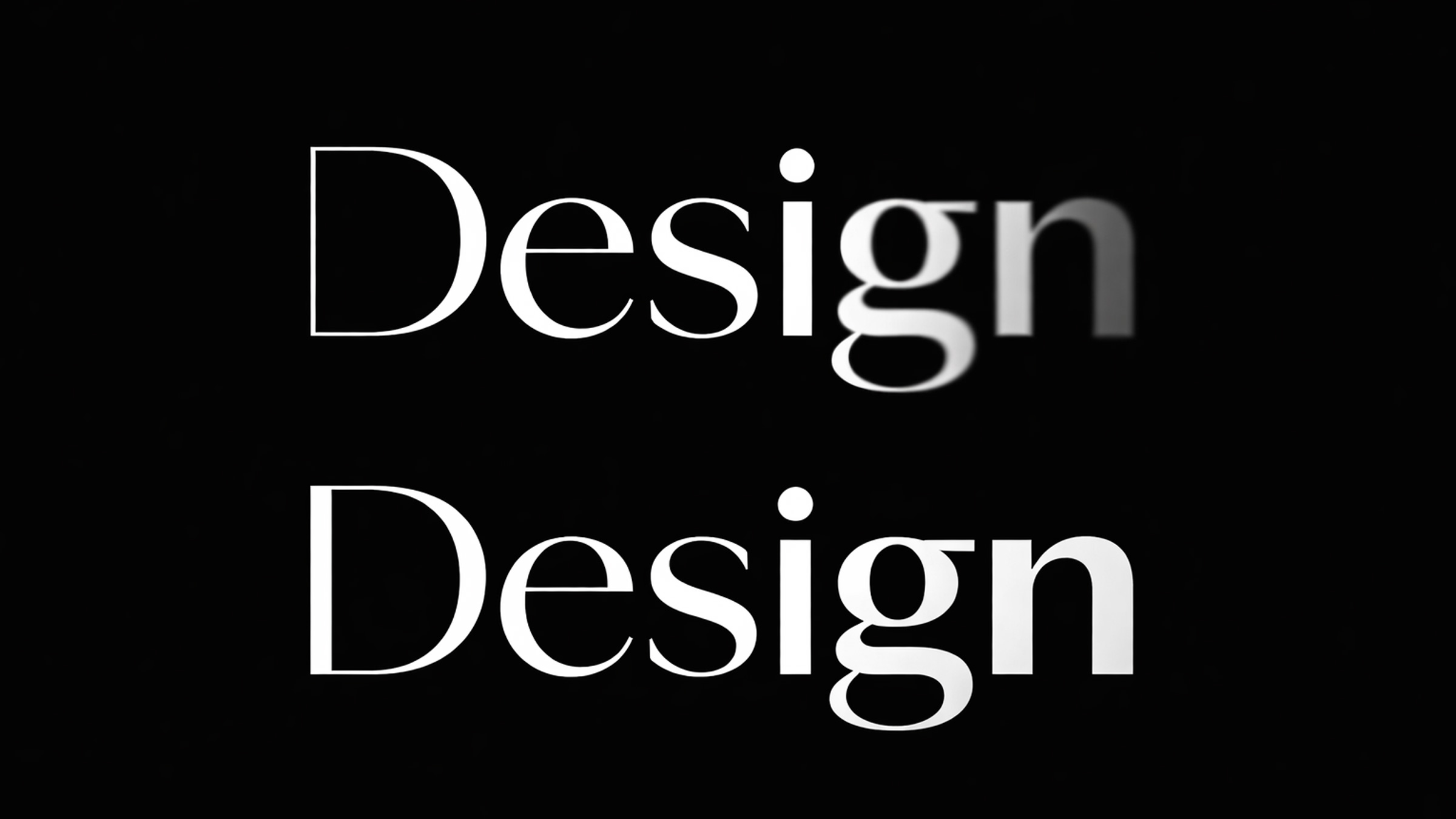
Variable fonts are the technical backbone making all of this possible. A single variable font file contains a continuous range of weights, widths, and optical sizes. Designers use these axes to create fluid transitions: headlines that subtly thicken on hover, body text that adjusts its optical size based on viewport width, or scroll-triggered weight animations that draw the eye. It’s kind of mesmerizing, honestly.
Combine this with CSS @property animations and font-variation-settings, and you get smooth, performant text effects that used to be impossible outside of motion graphics software.
Where this works best:
- Hero sections where the headline is the primary visual element
- Agency and portfolio sites where typography conveys creative confidence
- Product pages that animate feature names for emphasis
Where to be careful: avoid kinetic typography on body text or anything the user needs to read quickly. Animation should enhance headlines and display text, not mess with readability.
6. 3D Elements & Spatial Design
Three-dimensional elements on the web have officially crossed the line from “ooh, fancy” to practical everyday tool. Platforms like Spline, Three.js, and React Three Fiber have matured to the point where creating interactive 3D experiences no longer requires some specialized WebGL wizard on your team.
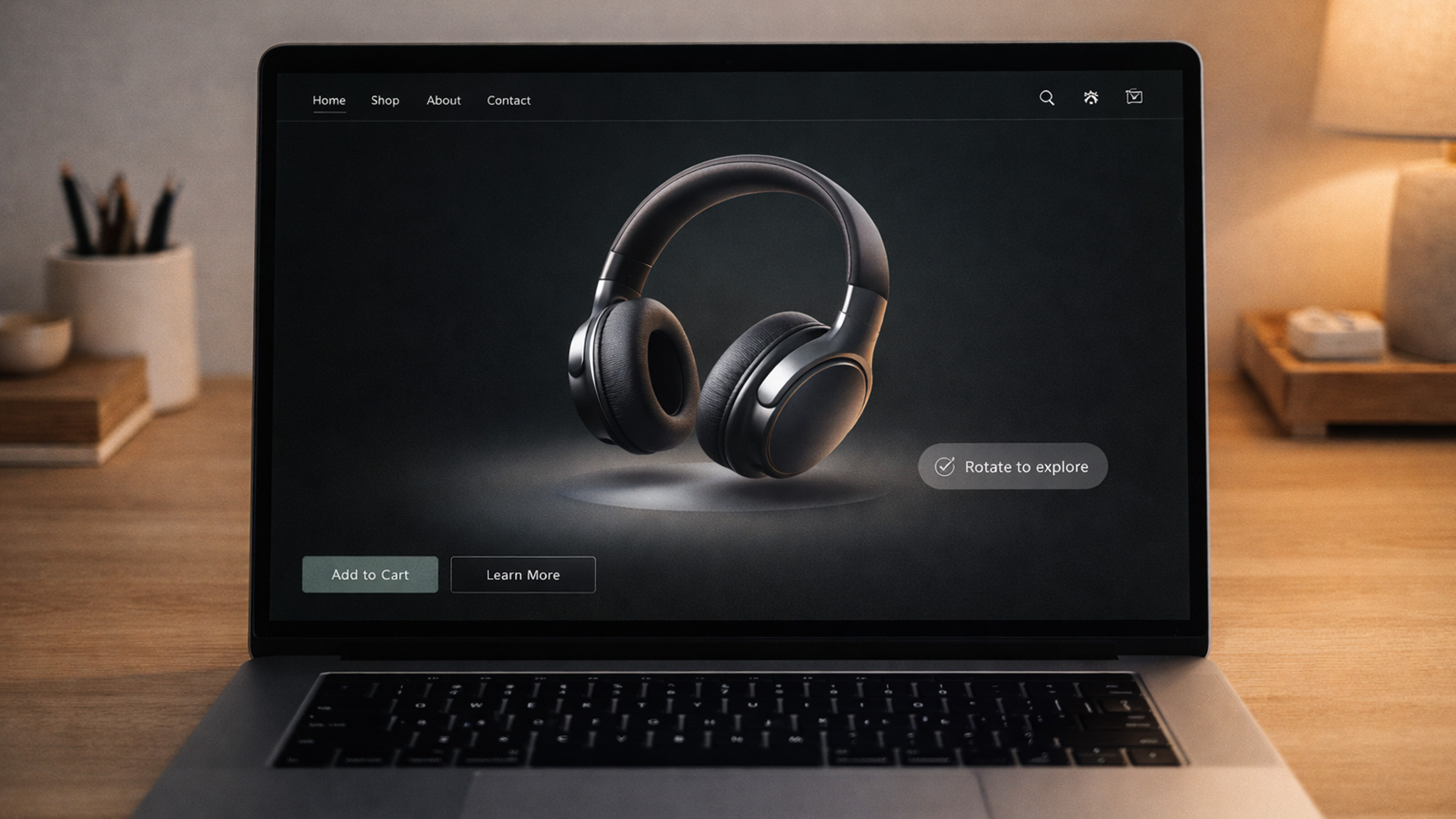
In 2026, we’re seeing 3D used in three distinct ways:
- Interactive product showcases: E-commerce brands letting users rotate, zoom, and explore products in 3D before buying. This actually reduces return rates and makes people way more confident about hitting that purchase button.
- Architectural and spatial walkthroughs: Real estate, hospitality, and interior design firms using embedded 3D environments to give visitors a real feel for a physical space. Super immersive stuff.
- Subtle 3D accents: This one’s the most sophisticated play, small 3D elements like floating shapes, animated icons, or depth-shifted layers used as design accents alongside regular 2D layouts. Adds dimension and polish without overwhelming the page.
Now, the performance conversation is real here. Poorly optimized 3D assets will absolutely tank your Core Web Vitals and send users running. The best practice in 2026 is progressive loading: show a static fallback image right away, then load the 3D scene once the page is ready and the user is actually engaged.
For businesses thinking about 3D: start with a single, high-impact placement (like a hero product viewer) instead of building the entire site around it. Let the technology serve the content, not the other way around.
7. Sustainable Web Design
Here’s one that might surprise you: the environmental impact of the internet is finally part of the design conversation. In 2026, sustainable web design isn’t some niche concern anymore, it’s a real differentiator that resonates with eco-conscious users and, bonus, directly makes your site perform better.
Every byte transmitted consumes energy. A bloated website with unoptimized images, autoplay videos, and excessive JavaScript doesn’t just load slowly, it has a measurable carbon footprint. The average web page now transfers over 2.5MB, and that number keeps climbing. Yikes.
Sustainable design principles gaining serious traction this year:
- Performance budgets as environmental commitments: Teams setting strict limits on page weight and actually holding themselves accountable
- Efficient media: Using modern formats (AVIF, WebP), responsive images with
srcset, and lazy loading by default - Reduced JavaScript: Shipping less client-side code, leaning on server rendering and native HTML/CSS capabilities
- Green hosting: Choosing data centers powered by renewable energy, providers like GreenGeeks, Krystal, and Cloudflare are leading the charge
The business case basically writes itself: lighter pages load faster, rank better in search, convert more visitors, and cost less to serve. Sustainability and performance are two sides of the same coin. Love that.
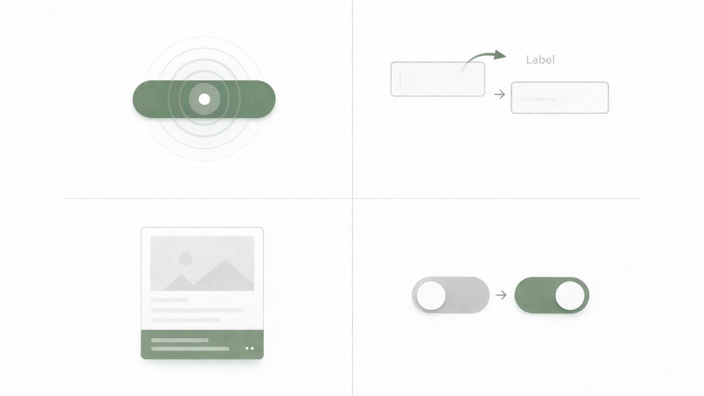
8. Micro-Interactions That Feel Human
The era of static, lifeless interfaces? Over. Done. In 2026, micro-interactions, those small, purposeful animations triggered by user actions, are what separate a good website from a genuinely great one.
And no, we’re not talking about gratuitous bounce effects or those spinning loaders nobody asked for. The micro-interactions defining this year are subtle, functional, and honestly kind of delightful:
- Button state transitions that give you tactile feedback, a slight scale, color shift, or ripple effect that confirms your click actually registered
- Form field animations that gently guide you through complex inputs, labels that float, validation checkmarks that animate in, progress indicators that fill up
- Hover reveals that preview content without requiring a click, product variations, expanded descriptions, or quick-view modals
- Contextual cursors that change shape or size based on what you’re hovering over, signaling interactivity before you even do anything
The technical barrier is lower than ever. CSS transition, animation, and the View Transitions API handle most use cases without any JavaScript dependency.
Here’s the golden rule: if a micro-interaction makes the user smile or saves them a moment of confusion, keep it. If it’s just there to show off your animation skills, cut it. Simple as that.
9. Accessibility-First Design
This one’s important, so listen up. Accessibility in 2026 isn’t optional anymore, and we mean that literally. The European Accessibility Act (EAA) kicked in full force in June 2025, requiring digital products and services in EU markets to meet accessibility standards. Similar legislation is tightening across the US, Canada, and Australia too.
But beyond just checking compliance boxes, there’s a genuine cultural shift happening. Designers and developers are starting to really get it: accessible design is better design, period. When you design for the widest range of human ability, you end up building interfaces that work better for literally everyone.
Accessibility-first design in 2026 looks like:
- Starting with semantic HTML before touching any styling, proper headings, landmarks, ARIA labels, and form associations
- Color contrast that goes beyond the minimum, aiming for WCAG AAA (7:1 for normal text) instead of just barely hitting AA
- Keyboard navigation as a first-class experience, every interactive element reachable and fully usable without a mouse
- Motion sensitivity respect, honoring
prefers-reduced-motionand never relying on animation to communicate critical info - Testing with real assistive technology, actual screen readers (NVDA, VoiceOver), switch controls, and voice navigation
For businesses, the ROI is super concrete: accessible websites reach a broader audience (roughly 16% of the global population has a disability), perform better in search rankings (Google explicitly rewards accessible markup), and reduce legal risk. That’s three wins in one.
The agencies delivering the best work in 2026 don’t treat accessibility as some checklist afterthought. They build it into their process from the very first wireframe.
10. Neo-Brutalism & Structured Chaos
If you’ve stumbled across websites that look intentionally “undesigned”, thick black borders, raw backgrounds, visible grid lines, clashing colors, and big bold sans-serif type, congrats, you’ve met neo-brutalism. This aesthetic is basically the design world’s rebellion against the polished, identical look of modern SaaS and corporate sites.
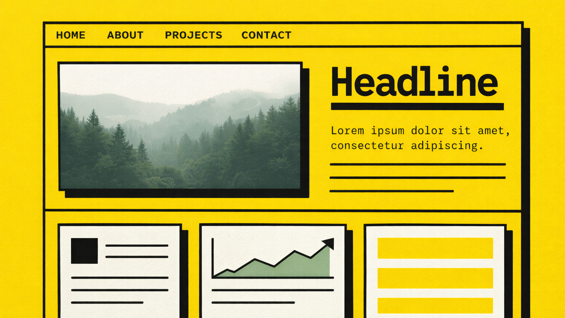
In 2026, neo-brutalism has grown up a bit. Designers are refining it into what some are calling “structured chaos”, layouts that feel raw and energetic but are still strategically organized so people can actually use them. Think of it as rebellion with discipline.
This trend absolutely slaps for:
- Creative agencies and studios that want to scream “we are NOT corporate”
- Event and festival websites where energy and personality are the whole vibe
- Startups targeting younger, design-savvy demographics
- Personal portfolios where the designer’s personality is literally the product
The key to pulling off neo-brutalism is intentionality. Every “broken” convention should be a deliberate choice that actually serves communication. Random visual chaos is just bad UX. Structured chaos guides the eye while surprising it.
Want to dip your toes in without going full brutalist? Try experimenting with visible borders, raw shadows (no blur), monospace accents, or a single bold, unexpected color against an otherwise clean layout. Baby steps.